Grand Prize Bailey Her Many Horses
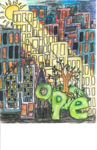 “Bailey’s piece is very detailed and intricate and expresses the message of hope on many different levels. Great use of colors to expres the contrast. Great use of thematic concepts – the hard lines of the building vs the soft green earthy lettering and plant life. The hard lines and wires of the buildings with the dark and foreboding color choices. A sophisticated use of contrast using the hard lines vs the soft lines of nature. The dark colors vs the light filled natural tones. Great use of layers and intricate detail. Life coming out of the mire of decay created a beautiful work for the theme of HOPE that represents the idea on many different levels.
Amelia Her Many Horses First Place
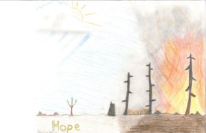 “Amelia uses a light touch and a subtle use of color. The contrast of the destruction vs the new growth springing up is also very subtle but very effective. The bold silhouetted lines of the trees stand out against the soft kinetic strokes of the background. The shifts in the direction of her coloring strokes create a sense of three different scenes within the one image. It is as if we are reading a story from right to left. Her creative choices feel very deliberate.”
Honorable Mention Kobe Gray Grass
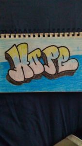
Kobe has great hand skills and composition. He shows great skill in hand lettering and in composing the frame/page. It is a very simple but effective interpretation of this month’s theme.
Merit Jada Good Crow
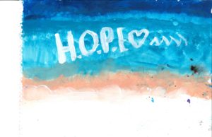 Jada use of soft color gives a soothing feeling. Great blending and gradation of color. A beautiful and abstract representation on it’s own, The letter amplifies the idea of hope We get a strong sense that this is what hope feels like to her. The abstract nature lets the viewer interpret it any way they wish.
Merit Kaylee Jo Miller
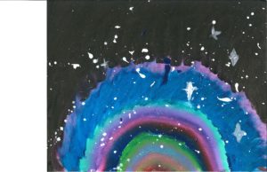
Kaylee gives a great representation of hope by contrasting a rainbow coming from the pitch dark. The contrast is very striking. Great use of color.
Leave a Reply