We are changing our name to MITAKUYE!
We will be shifting over our paperwork to the new spelling over the next few months but are happy to let everyone know that we are now officially The Mitakuye Foundation!
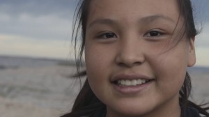 All of us here at Mitakupi are feeling heartbreak today as one of our students Tabria L. Red Cloud makes her journey. What a beautiful spirit! Always a smile on her face. Always ready to jump in and be of help. Always ready to try something new. We hold Tabria and her family and all of her BEAR family in our thoughts and prayers.
Congratulations to all of our winners!!
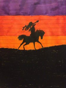
Grand Prize Winner: Joey Hill, Age 11
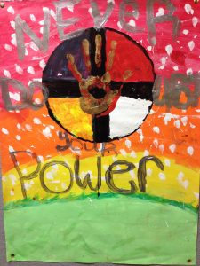
First Place Winner: Brianna High Wolf, Age 11
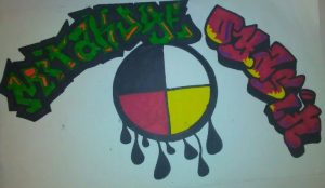
First Place Winner: Kobe Gray Grass, Age 18
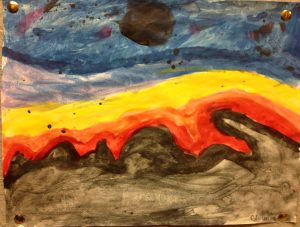
Honorable Mention Winner: Chamiqua Martinez, Age 11
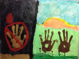
Merit Award Winner: Este Hill, Age 11
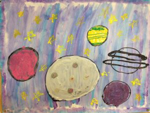
Merit Award Winner: Aaliyah Giago, Age 11
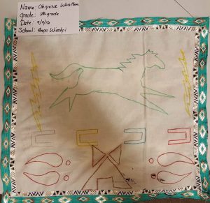
Merit Award Winner: Ohiyesa White Plume, Age 12
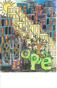 “Bailey’s piece is very detailed and intricate and expresses the message of hope on many different levels. Great use of colors to expres the contrast. Great use of thematic concepts – the hard lines of the building vs the soft green earthy lettering and plant life. The hard lines and wires of the buildings with the dark and foreboding color choices. A sophisticated use of contrast using the hard lines vs the soft lines of nature. The dark colors vs the light filled natural tones. Great use of layers and intricate detail. Life coming out of the mire of decay created a beautiful work for the theme of HOPE that represents the idea on many different levels.
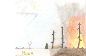 “Amelia uses a light touch and a subtle use of color. The contrast of the destruction vs the new growth springing up is also very subtle but very effective. The bold silhouetted lines of the trees stand out against the soft kinetic strokes of the background. The shifts in the direction of her coloring strokes create a sense of three different scenes within the one image. It is as if we are reading a story from right to left. Her creative choices feel very deliberate.”
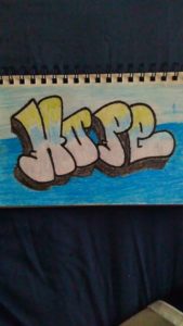
Kobe has great hand skills and composition. He shows great skill in hand lettering and in composing the frame/page. It is a very simple but effective interpretation of this month’s theme.
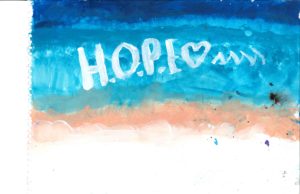 Jada use of soft color gives a soothing feeling. Great blending and gradation of color. A beautiful and abstract representation on it’s own, The letter amplifies the idea of hope We get a strong sense that this is what hope feels like to her. The abstract nature lets the viewer interpret it any way they wish.
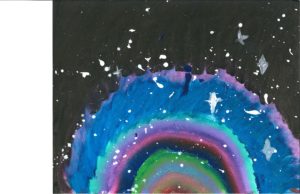
Kaylee gives a great representation of hope by contrasting a rainbow coming from the pitch dark. The contrast is very striking. Great use of color.
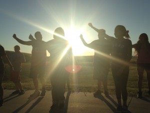 We are back from the reservation. Thank you again to all of our supporters! The program was successful beyond our expectations! Kids from all over the reservation gathered as a unified team of artists to learn and create together. In two short weeks the youth created 3 short films, played and wrote music, created an art and poetry magazine, learned a variety of visual mediums, wrote and performed spoken word poetry, created an exhibition full of paintings, drawings, and 3-dimensional art, learned and performed new styles of dance, made original choreography, and participated in a spoken-word music video which we’ll be debuting in the fall.
The greatest reward was seeing how these young people flourished when given the opportunity. Many of these young people have never had the chance to experiment with paint or charcoals, to learn choreography, to share and perform for their peers, to tell their stories to a supportive audience. Many have never had the opportunity to send their voice. They were fed, cared for, and heard.
It was beautiful, inspirational, and completely exhausting! And none of this could have happened without your support. Thank you for believing in the power of art to heal and for wanting to give these young people this opportunity.
What became so clear to us was that these young people need consistency and these programs need to happen more frequently than just once a year in the summer. We’re already planning for our fall event!
Our new website will launch next month and will feature a lot of the work the students did. We will keep you updated!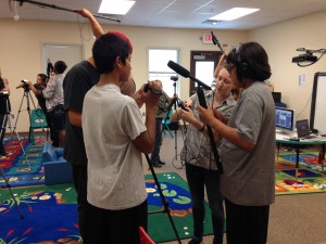
An amazing two weeks of creating art!
Congratulations again to all of the students for all of your hard work! And heartfelt thanks to everyone who helped make this possible: Simon J. Joseph, Paula Cantu, Yvonne DeCory, Eileen Janis, Lo Sprague, Gwynne Guibord, Lauren Bon, Metabolic Studio, Shakopee Mdewakanton Sioux Community, Agua Caliente Band of Cahuilla Indians, Bear Program, Oglala Lakota College, Meera Doranna LeVine, Ohiyaku Winyan, Stephanie Apple, Filmore Richards, Mary Tobacco, Val Charging Eagle Marilyn Pourier, Ricky Sage, Mary Gleason, Lynn Masuhara, Jill Frere, Brittanie Sterner, Maryan Captan, Jess Minckley, Terrie Mc, Kaitlyn Wayman-Dodd, Kulanandini Mahanta, Lauren Kleeman, Anika Maxwell, Elizabeth Warson, American Indian Art Therapy Lauren Stephens, Lisa Brunick, Jessie Park, Tee Iron Cloud, Saunie Wilson, LuAnn Werdel, Oelrichs School District, Wolf Creek Warriors – Oglala Lakota County School District, Jason Coppola, Mary Kirchen, Melissa Rathbone, Liz Casebolt,Janet Roston, Barry Weiss, Erik Marks, Swami Sarvadevananda, Doriane McCord, Roy Vongtama, Tory Mudd, Maureen Milligan, Tessa Hicks Peterson, Susan Matthews, Linda Yudin, Aditya Kalavagunta, Sachi Aamtya, Julie Janney, Jeremy Kagan, Lakota Prairie Ranch Resort, Singing Horse Trading Post, Stay tuned for pics and more updates on the program and the monthly art contest!!
Wopila!!
Jay’s photo grabbed us immediately. It perfectly captures the spirit of this month’s theme of FREEDOM! Some of the most eye catching elements were the movement of the flight of the subject, the use of silhouette against the puffy white clouds and the brilliant blue sky, and the low angle camera position which elevated the sense of height of the subject. Jay also demonstrates great skill in composition, use of foreground/background and the kinetic sense to catch the movement so well. A beautiful representation of freedom.